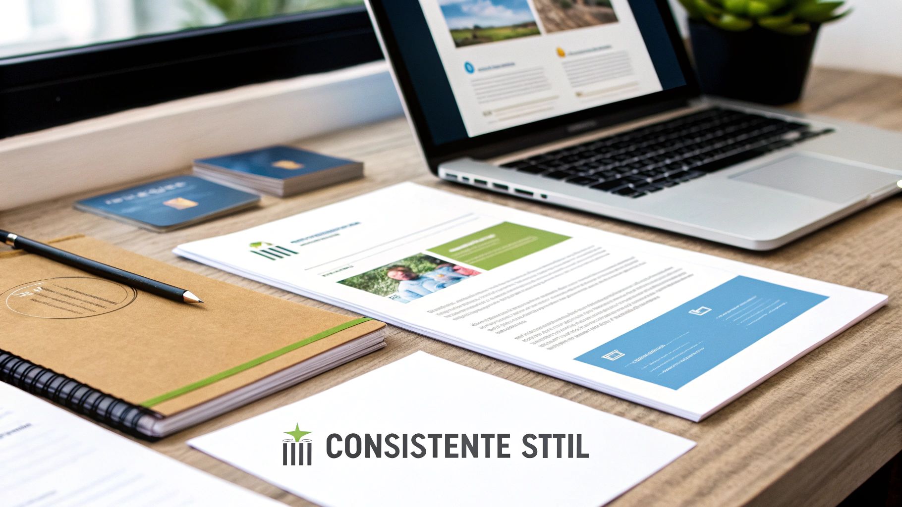
What exactly is a corporate identity, and why can't you live without it? Simply put: it's the visual soul of your company. It's the overall look and feel your brand conveys, from your website and social media to the business card you leave behind.
More than a logo: the complete visual identity
A corporate identity is often confused with just a logo, but that's just the beginning. Think of it as a person: your corporate identity is the clothing, voice, and demeanor that together create an unforgettable impression. Even before a word is spoken, your audience senses who you are.
So it's not a fluke. A strong corporate identity is the result of a well-thought-out strategy and smooth collaboration. The goal is to evoke a consistent and recognizable feeling with every interaction, across every channel. You tell a story without always needing words.
The core of visual communication
A truly effective corporate identity is created by the perfect blend of several core elements. It's the synergy between these components that makes the whole work:
- Logo: The figurehead, the most recognizable symbol of your brand.
- Color palette: The colours that determine the emotional atmosphere and immediately evoke a certain feeling.
- Typography: Your brand's "voice." Is it loud and powerful, or soft and elegant? The typeface speaks volumes.
- Visual language: The style of your photos, icons, and illustrations. Together, they enhance your story.
Bringing these elements together requires more than just a creative eye. It demands strategic insight. That's why choosing an experienced partner is so crucial. A good partner won't just design something beautiful; they'll work with you to build a visual identity that strengthens your brand story and conveys it authentically.
Think of a good partner as a translator: someone who, in close collaboration, translates your vision and brand identity into a visual language that your target audience immediately understands and feels.
Investing in a strong corporate identity is actually investing in trust. And that trust is crucial. Research shows that no less than 81% of the consumers People must trust a brand before they consider buying something. A consistent and professional image is the first step in gaining that trust. You can read more about the link between branding and trust in [This sentence appears to be a translation of the original text]. these insights from WiserNotify.
The four pillars of a strong visual identity
A rock-solid corporate identity hinges on four crucial building blocks. Think of them as the foundations of your brand. They're not just random elements thrown together; they're a carefully considered whole where everything is perfectly aligned to tell your unique story.
You can compare it to building a house. If the foundation is flawed, the entire structure becomes unstable. That's why it's so important that each pillar is strategically deployed, so that together they form a cohesive and compelling whole.
These elements work together to create an instantly recognizable image, as you can see below.
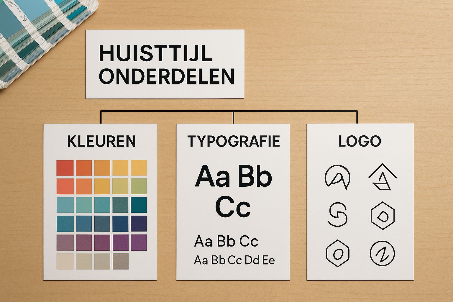
Every element—from logo to font—contributes to the overall brand experience. Let's take a closer look.
1. The logo: the face of your brand
Your logo is the most immediate point of recognition, the visual anchor of your brand. It's often the very first impression a potential customer gets of you. A strong logo is much more than just a pretty picture. It's simple, memorable and versatile, so it looks just as good on a billboard as it does on a small smartphone app. It's the visual signature that's reflected everywhere.
2. The color palette: the language of emotion
Colors speak a language we all understand instinctively, often faster than words. A well-chosen color palette immediately evokes a certain mood or emotion. Think of the familiar blue of a financial institution, or the fresh green a brand associates with sustainability. These choices are anything but arbitrary.
An effective color palette isn't a matter of taste, but of psychology. It's a strategic tool that influences the perception of your brand before the customer even reads a word.
The right color combination not only ensures recognition but also reinforces your brand's core message. It's the visual background music that sets the right tone.
3. Typography: the voice of your brand
Typography—your choice of fonts—sets the tone of voice for your written communication. Does your brand come across as serious and professional, or playful and approachable? The fonts you use define that tone.
A clean, sans-serif typeface like Helvetica feels modern and direct. A classic serif typeface (think of the "feet" on the letters), like Garamond, exudes tradition and authority.
- Serif letters: Ideal for a traditional, reliable and formal look.
- Sans-serif letters: Perfect for a modern, simple and accessible atmosphere.
4. The visual language: the visual story
The visual language is all that remains: the photos, illustrations, icons, and graphic elements you use. These images should have a consistent style that visually supports your brand story.
Do you prefer warm, human-like photos or sleek, technical illustrations? Do you use abstract patterns or realistic images? This choice determines how your brand feels and is perceived. A coherent visual language ensures that your entire visual identity fits together like a puzzle.
Below you will find an overview of how these four pillars work together to create a strong and recognizable corporate identity.
The four pillars of a corporate identity
An overview of the key components of a corporate identity and their function within brand identity.
| Component | Function | Why it's important |
|---|---|---|
| Logo | Instant recognition | The visual anchor that is noticed and remembered first. |
| Color palette | Emotional connection | Subconsciously evokes feelings and associations in your target group. |
| Typography | Tone and personality | Defines your brand's 'voice' in all written communications. |
| Visual language | Atmosphere and context | Tell your brand story visually through photos and illustrations. |
Each of these components plays a vital role. It's the synergy between these four elements that truly makes a corporate identity work and sets your brand apart.
Why consistency makes your brand unforgettable
A strong corporate identity is much more than just a pretty picture. It's a strategic tool. When you apply every visual element consistently, from your website to your email signature, you build something incredibly powerful: instant recognition. Think of it as the common thread that connects every interaction with your audience.
Think about the last time you saw a product from your favorite brand. You probably recognized it immediately, even before you read the name. That's the power of consistency. It creates a seamless and reliable experience that builds trust. Whether someone encounters your brand on social media, receives an invoice, or flips through a brochure, the feeling should be the same every time.
Building trust and professionalism
A consistent corporate identity radiates professionalism and reliability It demonstrates attention to detail and a clear vision behind the brand. This doesn't just apply to commercial companies; even government agencies build trust this way. It turns out that citizens perceive communications with recognizable Flanders branding as more reliable and more serious. You can read more about this at the Vlaanderen.be website about the impact of a coherent corporate identity.
To maintain this consistency in practice, effective collaboration with an external partner is often essential. Such a partner not only helps create the corporate identity but also maintains visual unity across all channels. This partnership ensures that your brand story remains clear and consistent, which is crucial for standing out in a crowded market.
Differentiate yourself from the competition
In a market flooded with visual stimuli, it is crucial to be different. A unique A consistently applied corporate identity ensures you don't disappear into the crowd. It gives your brand a unique face and personality, allowing customers to not only recognize you but also truly identify with you.
A consistent corporate identity isn't a constraint, but a compass. It ensures that every creative choice, from social media posts to webpages, contributes to the same goal: building a strong and unforgettable brand.
This visual discipline is the foundation for sustainable growth and customer loyalty. It also helps to strengthen your online visibility through search engines. In our article about the difference between SEO and SEA learn how a strong brand contributes to this.
Inspiring examples from Belgian soil
Theory is one thing, but a corporate identity only truly comes to life when you see how strong brands put it into practice. And we don't have to look far to see that. Let's take a look at a few top Belgian brands and analyze how they visually translate their core values.
These examples prove that a corporate identity is much more than just a nice coat of paint. It's a strategic weapon that tells your company's story, often before you even say a word.
Colruyt: efficiency in pictures
Colruyt's corporate identity is a textbook example of how to visually deliver on a promise—the lowest prices. Everything about it screams simplicity and efficiency. The logo? Simple, straightforward, and without any frills.
That familiar red color is purely functional: it draws attention in the brochure and in the store. The typography is equally clear and unfussy. You won't see any expensive, stylized photography, because the focus is crystal clear on the product and the price. That visual simplicity builds unconscious trust to the customer: this company doesn't waste money on nonsense, but focuses on what matters to me.
Duvel: iconic and a bit rebellious
Duvel perfectly demonstrates how to combine tradition and modern flair. The iconic red logo with its Gothic "D" exudes heritage and pure quality. The combination of red, white, and black feels powerful yet timeless.
Yet their communication is often surprisingly minimalist and bold. The typography on the bottle and packaging is instantly recognizable and exudes unwavering confidence. Thus, Duvel masterfully positions itself as a premium pilsner, yet one with an accessible and somewhat rebellious edge.
A brand identity only truly works if it evokes the same emotion every time. Whether you visit the website, see an ad, or hold the product, the experience must be seamless and recognizable.
These Belgian gems show how a well-thought-out visual strategy can make your brand unforgettable. Looking for more ideas to boost your own brand? Then be sure to check out our page full of business inspiration.
Developing a corporate identity together in 4 clear steps
A strong corporate identity? It doesn't just happen. It's not a matter of choosing a nice color and being done with it. No, a truly effective corporate identity is the result of a well-thought-out process where strategy and creativity go hand in hand.
By breaking this process down into clear steps, we keep it manageable. And honestly, with an experienced partner at your side, each phase is not only easier, but also much smarter. Such a partnership fosters dialogue that helps you ask critical questions and make choices that truly advance your brand.
Step 1: The Foundation – The Brand Strategy
Before we even think about a font or a color palette, we have to dig. Deeper. What is the core of your brand? Who are you, what do you stand for, who do you want to reach, and what makes you different from the rest? That strategic session is the absolute starting point.
Together with an expert, you'll define your brand's personality. This is crucial, otherwise your corporate identity will become an empty shell—beautiful on the outside, but empty of substance. By building this foundation together, you ensure your corporate identity becomes an authentic representation of your company's DNA. It's the blueprint for every creative decision that follows.
Step 2: Capturing the mood – the visual direction
Okay, the strategy is in place. Time to translate that abstract story into a concrete atmosphere. A mood board is the perfect tool for this. Think of it as a visual brainstorm: a collage of images, textures, colors, and fonts that together evoke the right feeling.
This is where a good partner proves its worth. A designer helps you see beyond your own taste. It's not about what you personally like, but about which visual style strikes the right chord with your target audience. It's a smooth collaboration that ensures an objective and, above all, effective approach.
Step 3: The Building Blocks – Designing the Core Components
With the strategy and visual direction in place, it's finally time to get creative. The logo, color palette, typography… all these elements are now being designed and perfectly coordinated.
This is where craftsmanship makes all the difference. A good logo is more than just a pretty picture; it's recognizable, timeless, and works everywhere—from a small icon on your smartphone to a large banner at a trade show. Co-creating with a professional ensures that all the pieces fit seamlessly into a strong and consistent whole.
Step 4: The Manual – Recording Everything in a Style Guide
The last step is perhaps the most important for the long term. We record all the choices we have made in a style guide or brand bookThis is the definitive guide for anyone working with their brand. The document describes in detail how to use the logo, colors, and fonts correctly.
A style guide isn't a straitjacket that restricts creativity. It's a guarantee of consistency. It ensures your brand always looks professional and recognizable, no matter who's creating the communication.
Developing a corporate identity is an investment that pays off many times over in terms of recognition and trust. Good to know: as an SME in Flanders, you can apply for subsidies for this kind of strategic advice. Learn more about the SME portfolio for advice and trainingThis is how you create a sustainable visual identity that is ready for the future. Belgian design trends are also constantly evolving, with a clear shift toward minimalism and functional design. Research shows that component-based design systems, as defined in a style guide, are increasingly becoming the norm. Read more about these insights into design trends on DesignWiz.
Still have questions about corporate identity and branding? Here are the answers.
A good corporate identity builds trust, but the process itself can raise some questions. No problem. Here, we'll dive into the most common questions to clarify everything.
Building a visual identity might seem like a huge undertaking, but with a good partner at your side, it becomes an engaging and manageable process. Let's connect the dots.
Corporate identity and brand style: aren't they the same thing?
Many people lump these terms together, but there is an important difference. You brand identity It's the big, strategic story: your mission, your core values, your brand's personality. It's the soul of your company.
You corporate identity is what that soul looks like. Think of the clothes your brand wears, the tone of its voice. It's the visual translation that makes your brand identity tangible to the outside world. The corporate identity is therefore a crucial, visible piece of the puzzle of your overall brand identity.
How much does it cost to have a corporate identity created?
That's a question with many answers. Costs vary widely. A simple logo design can cost you a few hundred euros, but a fully developed corporate identity for a larger company, including a comprehensive style guide, can easily run into the thousands.
The price depends entirely on what you need and who you partner with. Don't see it as an expense, but as a smart investment in your brand's recognition and professional image. A good partner will always provide you with a clear quote, perfectly tailored to your needs.
Can I create a corporate identity myself or should I hire an expert?
Of course, with tools like Canva You can get a long way on your own these days. However, collaborating with a professional yields a much stronger and more lasting result. A designer combines objective expertise with creativity, creating a corporate identity that's not only beautiful but also truly works for your brand.
Partnering with an expert guarantees results that truly strengthen your brand. It's the most efficient way to develop a visual identity that perfectly aligns with your business goals and is consistently applicable across all channels.
Working with an agency not only speeds up the process but also protects you from typical beginner mistakes that can prove costly later on. It's the assurance of a professional approach, from the first sketch to the final result.
How much time should I allow for the entire process?
The turnaround time depends heavily on the complexity and how smoothly the collaboration flows. A basic logo can sometimes be ready in just a week or two.
For a complete corporate identity project – from the strategic kickoff and the first concepts to the final style guide – you can expect a lead time of four to eight weeksClear communication and short lines of communication with your design partner are invaluable for ensuring everything runs smoothly and within the deadline.
A strong corporate identity is the cornerstone of every recognizable brand. Expert media We'll guide you as a true partner, with over 21 years of experience, through every step of this creative and strategic process. Ready to give your brand the professional look it deserves? Contact us today and discover what we can do for you. https://www.expertmedia.be.